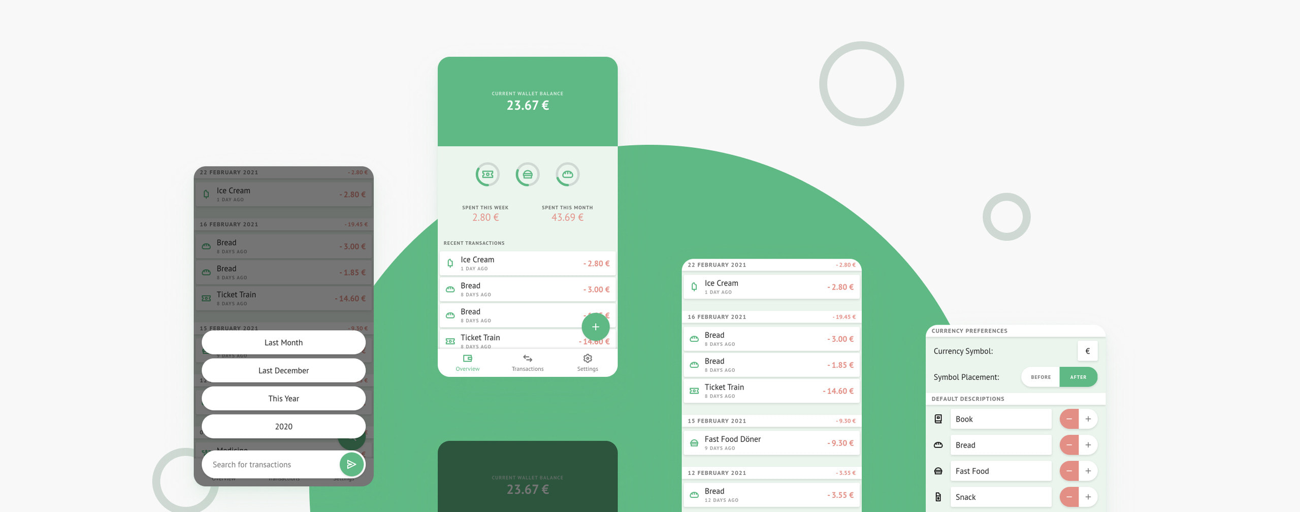
Hero image for Prt MnyHero image for Prt Mny

goal

Keeping track of what goes in and out of my wallet

Prt Mny

Have you ever gotten money from an ATM only to find your wallet empty again two days after? It happened to me and I knew I didn’t lose it, and I certainly hadn’t been robbed. The truth is, most people don’t pay much attention to the change they spend from their wallets, even though over time that can become quite the sum of money.

There’s plenty of money management apps out there, but most I found wanted access to my bank account, or made adding transactions so complicated that it became cumbersome. I wanted something simple, quick, and safe to keep track of what went in and out of my wallet. So I created Prt Mny.
  • financial
  • progressive web app
  • ui design

😢
Sorry, but embedded content is not available when JavaScript is deactivated.

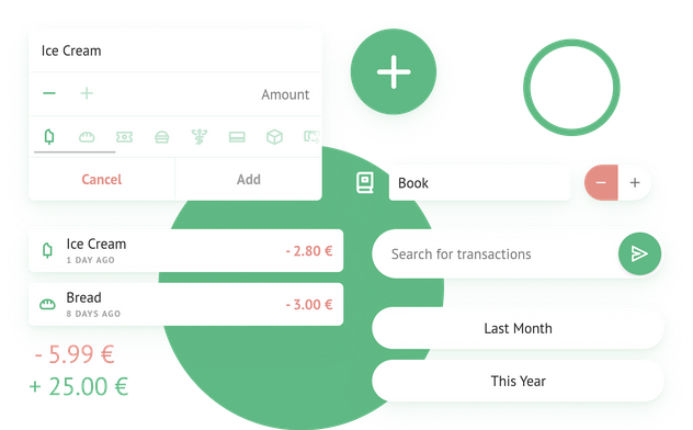
Various components of the Prt Mny app spread out on a background of green circles

Since entering a transaction has to be done manually after every purchase, it had to be as quick and easy as possible. Thanks to the compact “Add Transaction” overlay, entering a transaction takes just typing the amount and selecting the icon that best describes the nature of the transaction.

Some of the icons to be found in the application. The icons for pizza, shopping bag, ice cream, and hair dryer are scaled up and highlighted in a green colour

All icons I created for Prt Mny are set within a 18x18px square and use rounded line caps with a 2px stroke. They are meant to cover a large amount of different items people spend money getting, while being generic enough to apply to multiple use cases as to not overwhelm the user with too much selection and making a specific icon hard to find. In the settings of the app, a custom description can be entered for each icon to make adding frequent transactions even more efficient.

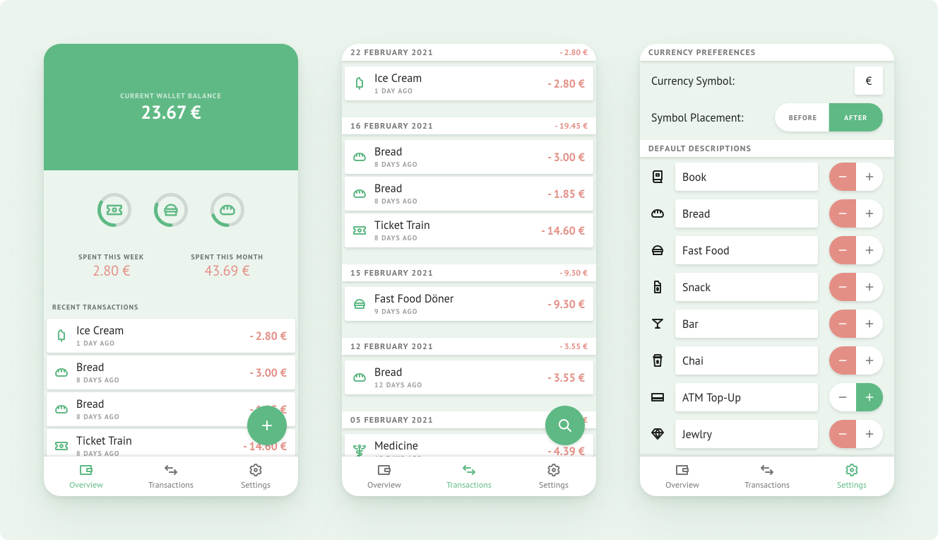
The three main screens of Prt Mny: Home, Transactions and Settings