Let’s get one thing right out of the way: no, Penpot isn’t as good as Figma. I can’t and won’t replace Figma with it for the time being. But that’s okay. Just because I won’t, it doesn’t mean you can’t—or shouldn’t. In fact, when I started out with web and graphic design, Penpot would’ve been my dream screen design tool.
It runs on Linux—and does so while feeling like a first party citizen, not an afterthought. It’s free and open source. It’s easy to get started with, while offering most, if not all, features an aspiring web / app / graphic designer could wish for. It actively gets new features, some of which seem at the forefront of the industry. The UI was significantly improved since I last looked into it, which was when the first Alpha version was released.
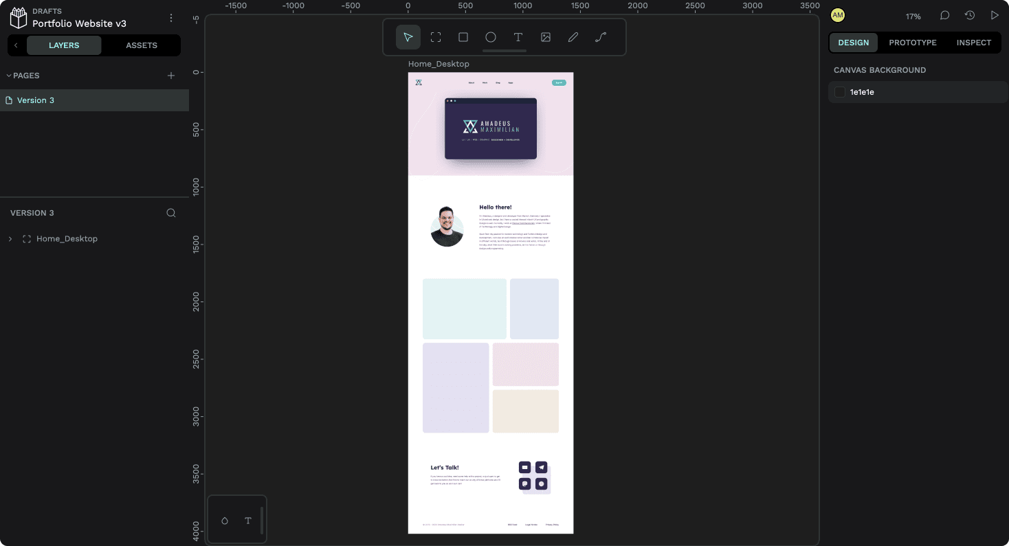
For someone who started out creating their first app and web designs in Inkscape (another terrific open source design tool more geared towards vector illustrations), Penpot really is everything I could’ve wished for back then. So in order to celebrate their recent 2.0 release, I decided to take another look at it and re-evaluate it after letting it simmer at the back of my mind for the last three years. And since I’ve been playing with a few new ideas for the next iteration of my website, why not build a design for the home page with it?
Here’s how that went.
What I Enjoyed
Even today, there are a bunch of things I like about it and miss in that other design tool. For example, there is a “focus mode” which lifts the current selection out of the canvas into its own canvas without distractions. This is great to focus on a single screen, or even an individual section or component, without being distracted by the rest. Blender used to (and maybe still has) the same thing, and it’s invaluable for collecting focussed feedback.
Standard Names for CSS-Adjacent Features
Features are also named very close to their CSS counterparts, which makes Penpot an excellent tool to teach aspiring web designers about paddings, absolute positioning, and especially flex and grid layouts. This, paired with a detailed “code” view, might allow some less experienced developers to have a good starting point when implementing a given design. However, I found the generated code leaning too heavily on absolute positioning in order to be truly copy-pasteable, especially when considering responsiveness.
Grid Layout
Speaking of CSS features, the headlining addition of Penpot 2.0 (along with the reworked UI, which is admittedly looking very sharp) is a visual way to define and work with grids. This is an incredibly powerful feature, which was a bit difficult to get into with no prior preparation—there is some documentation and a few tutorials on the feature out there already—because of the sheer breadth of its options, but became intuitive enough once I had found my way around the UI.
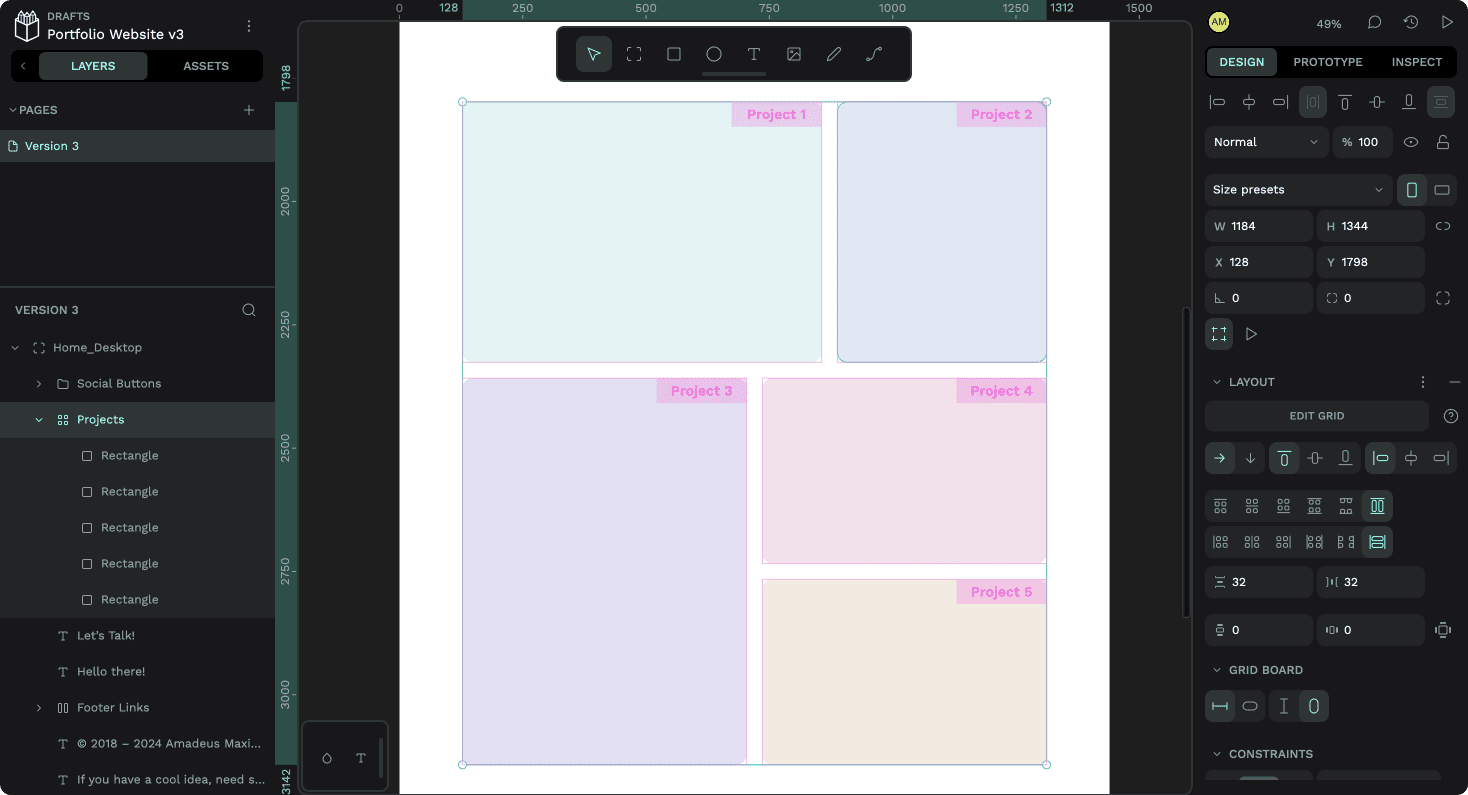
I really liked that I could name the different areas of the grid I had defined for an idea on how I could present the projects on my website, and how the coloured rectangles seamlessly fit themselves into those areas once I dragged them into the grid. This kind of layout would not be possible with Figma’s Auto Layout feature, at least without using deeply nested sub-Auto-Layouts. In Penpot, it’s a single group. Impressive!
It’s FOSS!
Obviously, another huge plus is that Penpot is completely free and open source. Anyone can create an account and enjoy all features without worrying about hitting a paywall—and they could even host their own version! If I’m not mistaken, there’s even an offline-version in development by a community member, which will work completely locally without the need to set up a server. Files can be saved as SVGs with additional metadata stored in a JSON-file alongside it, making them interoperable with tools like Inkscape or pretty much anything else that understands SVG.
The Little Things
Then there are some little things, like how Penpot apparently stores the nudge amount preferences as part of the account (or at least set them to the very reasonable default of 8px per big nudge) and how easy it makes it to import custom fonts for a project and all its members, which simply is impossible in Figma on Linux without an enterprise account.
It even seems to support vector networks, something that immediately made me fall in love with Figma for icon design—unfortunately that’s also where the issues started for me while drawing up the design of my reworked landing page.
Things That Need Some Work
The path tool feels really underdeveloped. It has no way that I could find to intuitively bend paths without using the control handles, and the handles themselves lacked options to mirror their size or angle. The whole process of converting a node to a sharp or rounded corner felt odd and convoluted. Unfortunately, there also were no options to round off individual sharp nodes, making the process of drawing icons a lot more tedious and error-prone.
Performance
It also felt like something was off with the performance on my M2 MacBook Air in Chrome. Especially panning and zooming felt sluggish, despite the rather simple file. To be fair, this could also simply be an issue of the acceleration curves for panning and zooming, since they didn’t feel laggy, simply slow. And while the loader animation continues to be delightful, I feel like the rest of the UI could benefit from some animations and transitions as well.
Unreliable Snapping Features
Much more of an issue was that I felt like the snapping functions were unreliable. I couldn’t get guides to snap to existing objects on the canvas and when I was moving / resizing layers, they did not always snap to the guides with their edges, but rather where my cursor happened to be along the edge. Resizing a rectangle while holding the option-key to resize it from the centre also seemed to disable snapping. I like to be very precise in my design work, and so this unreliability made the process more annoying for me.
No Layer Resizing with Keyboard
I’ve also come to rely on being able to resize layers using the keyboard for maximum precision, but I couldn’t find a way to do that in Penpot. The keyboard shortcuts I tried using for it (CMD + arrows) are used to change layer order instead—which is a good thing, since it makes reordering layers with the keyboard more intuitive on non-QWERTY keyboard layouts, but I’d still rather have the ability to resize layers with the keyboard.
A 14px Default Font Size?
When it came to adding some text to my design, I was surprised to find out that the default font size was 14px, which came very much as a surprise when the generally agreed upon default font size of anything on the web seems to be 16px. I could also not find a setting to change that, but thankfully it seemed like the text tool remembered the last settings used, so at least I only had to adjust it once. In larger projects with defined type styles, this may also be a little less of an issue, but it threw me nonetheless.
However, what I found to be a much bigger issue was that there generally seemed to be a lot of typography features missing. I could not set a value for paragraph spacing or indents, for example, nor could I access the different font feature settings available in the fonts I picked. These seem pretty essential for text-heavy designs.
Other Missing Features
I was also surprised to find out that there is no way to copy and paste layer styles. Initially, I simply thought I had missed some option in a menu or a keyboard shortcut, but when looking it up, I found an open ticket regarding that feature. It’s good to know that it might be addressed in the future, but when I was creating the contact buttons for my design, I really felt its absence.
It also seems like there is no way to resize an artboard or container while ignoring the constraints set up for the objects within, something I apparently do fairly often and would never have noticed if it had just worked.
In the hero section of my design, I wanted to add a slight background blur to the area behind the menu, but unfortunately that also doesn’t seem possible yet.
Oops, something went wrong…
Speaking of blurs, pasting over my terminal design as an SVG from Figma worked surprisingly well, including the shadow, which is a blurred rectangle. Unfortunately, pasting the masked portrait shot of myself I had prepared beforehand took a very long time. It seemed like it wasn’t going to work at all, until it suddenly popped up. Positively surprised, I went ahead and selected it in order to reposition it—and Penpot crashed.
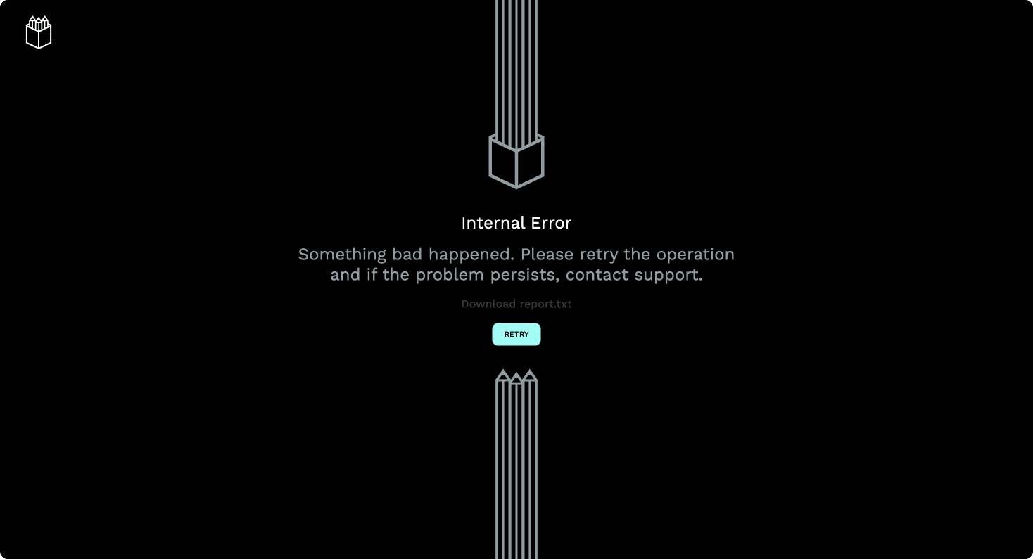
I was able to recover the file without problem and had lost no progress except for the now missing pasted portrait. It actually kept popping up every once in a while like a ghost with unfinished business, but it was nowhere to be found in the layers panel. In the end, I simply imported the masked portrait as a PNG instead of an SVG, and it could move on.
So, how’d it go?
As is apparent from the screenshot at the beginning of this post, I was able to finish the design idea. It took longer than it would have taken me in another tool—but that’s to be expected. So were some of the hiccups I experienced along the way. It is a different tool with a much smaller team, after all.
However, I feel calling a release “2.0” implies a certain degree of polish, feature completion and stability that I couldn’t quite find when using the application. There just were too many little paper cuts, including some visual bugs like selections not disappearing properly, and keyboard shortcuts like showing and hiding guides being inaccessible on a QWERTZ keyboard.
Don’t get me wrong, though—this new version is miles ahead of the Alpha I tried so long ago. There is a lot to like, and I’m sure things will only improve with time.
So while I personally won’t be using Penpot for design work regularly, I will show it as an alternative to Figma when teaching my classes and will try to incorporate the Grid Layout feature as a way to teach CSS Grid more visually. And if you’re just starting out with web or app design, I encourage you to give Penpot a try as well. Open source software is incredibly important, especially in this age of enshittification.
As always, feel free to let me know what you think over on Mastodon and enjoy spring! Thank you for reading.
I am not associated with Penpot in any way or form and was not asked to write this article, nor did I receive compensation for doing so.